A step-by-step detailed guide on ‘How to Design a Landing Page in Systeme.io? (Without Losing Your Mind)
Alright, folks, buckle up because today, we’re diving into the wonderful, slightly frustrating (but totally worth it), world of landing page creation in Systeme.io. Whether you’re launching a business, selling a life-changing course, or just trying to get people to sign up for your revolutionary idea (like a subscription box for pet rocks), you need a landing page that converts. And you need it yesterday.
So, grab your coffee, elevate your patience, and maybe a stress ball — because we’re about to design a stunning, high-converting landing page in Systeme.io, step-by-step. Let’s get started!
First of all, log in (And Don’t Panic)
First things first, head over to Systeme.io and log in. If you don’t have an account yet, congratulations! You get to enjoy the thrill of setting one up. It’s free, and it takes less time than explaining to your grandma what an online funnel is.
If you don’t have an account created, just hit the ‘create one for free’ link sitting at the bottom of the login screen, and you shall find the following screen thrown your way.
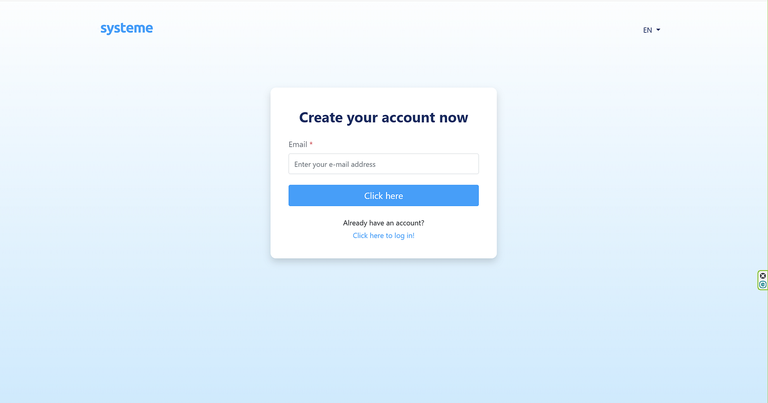
Type in your email that you’d like to use for this account, and hit ‘click here.’
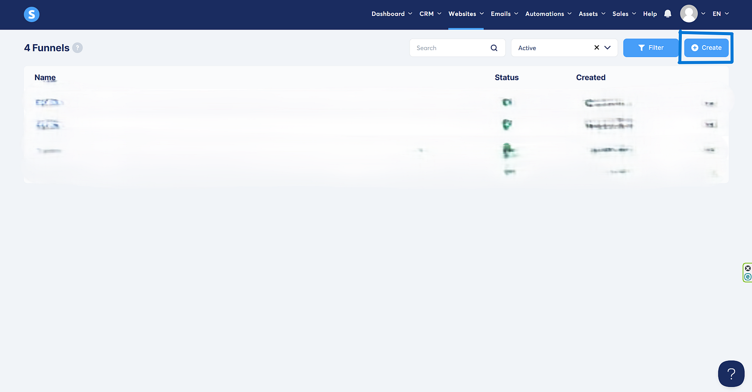
Once you’re inside, click on Sales Funnels from the dashboard. Why? Because a landing page is a critical part of your sales funnel, and Systeme.io groups them all together like a happy little marketing family.

Time to create a New Funnel (Like a Pro)
Click the big, happy Create Funnel button sitting comfortably at the top right corner.
Systeme.io will ask you what you want to do:
- Build an audience (Translation: Get emails like a digital hoarder)
- Sell a product (Translation: Take people’s money in exchange for something awesome)
- Custom (Translation: You don’t follow rules, and we respect that)

For the sake of this tutorial, let’s choose ‘Build an Audience,’ because our plan is to build an audience and to have an email list. It usually includes an opt-in page and a thank-you page.
The ‘Sell’ option is designed for selling digital or physical products, and in the sales funnel you can include sales pages, checkout pages, and thank-you pages.
The ‘Run an Evergreen Webinar’ option is where you can automate webinar registration and replay sequences, and because we’re talking about webinars, this option usually includes registration pages and event pages.
The ‘Custom Funnel’ option gives you full control over funnel structure, as it allows adding different page types manually, but like I mentioned earlier, for this tutorial, we’ll stick to ‘build an audience,’ which shall give you a clear idea how to build a landing page, and then you’re free to experiment with the rest, if your patience allows you 🙂

Name should be whatever you’d like to call your funnel, just to organize it better. For this demonstration, I’m going to use ‘Saj’, now don’t ask me why.
The domain name can be set to default, or in this case, since I have purchased a domain name (cashcookies.org), I’ll type that in. If you have multiple domains connected to Systeme.io, you can choose different domains for different funnels that you create.
You can also choose the currency you’d like to use in your transactions, and since I’m from Canada, I’d choose Canadian dollars as my currency; of course this will differ depending on your location, and preference.
Once you hit ‘Save’ you should be able to see the following screen.
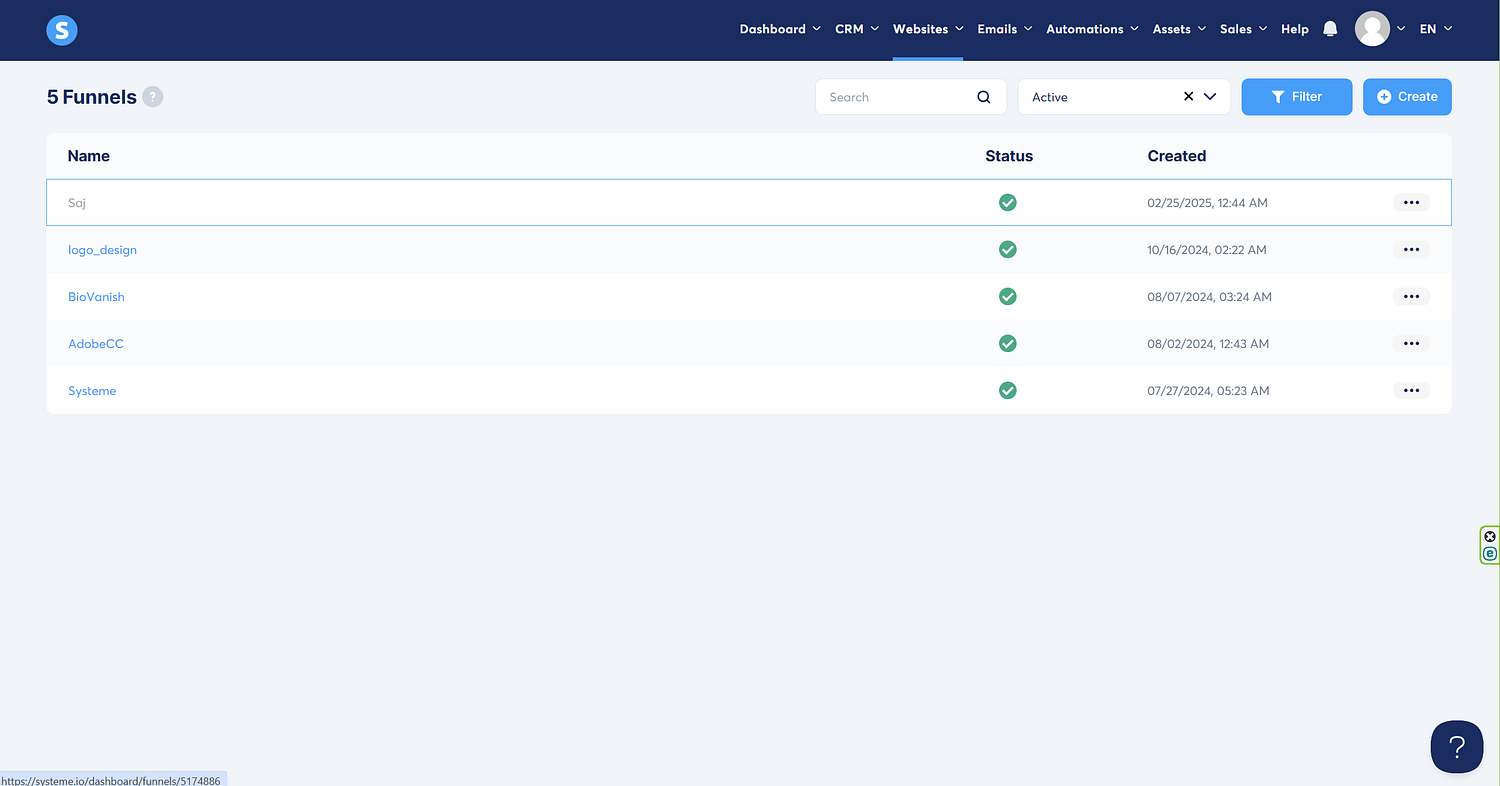
Click the funnel name ‘Saj’, and you should see the following screen.
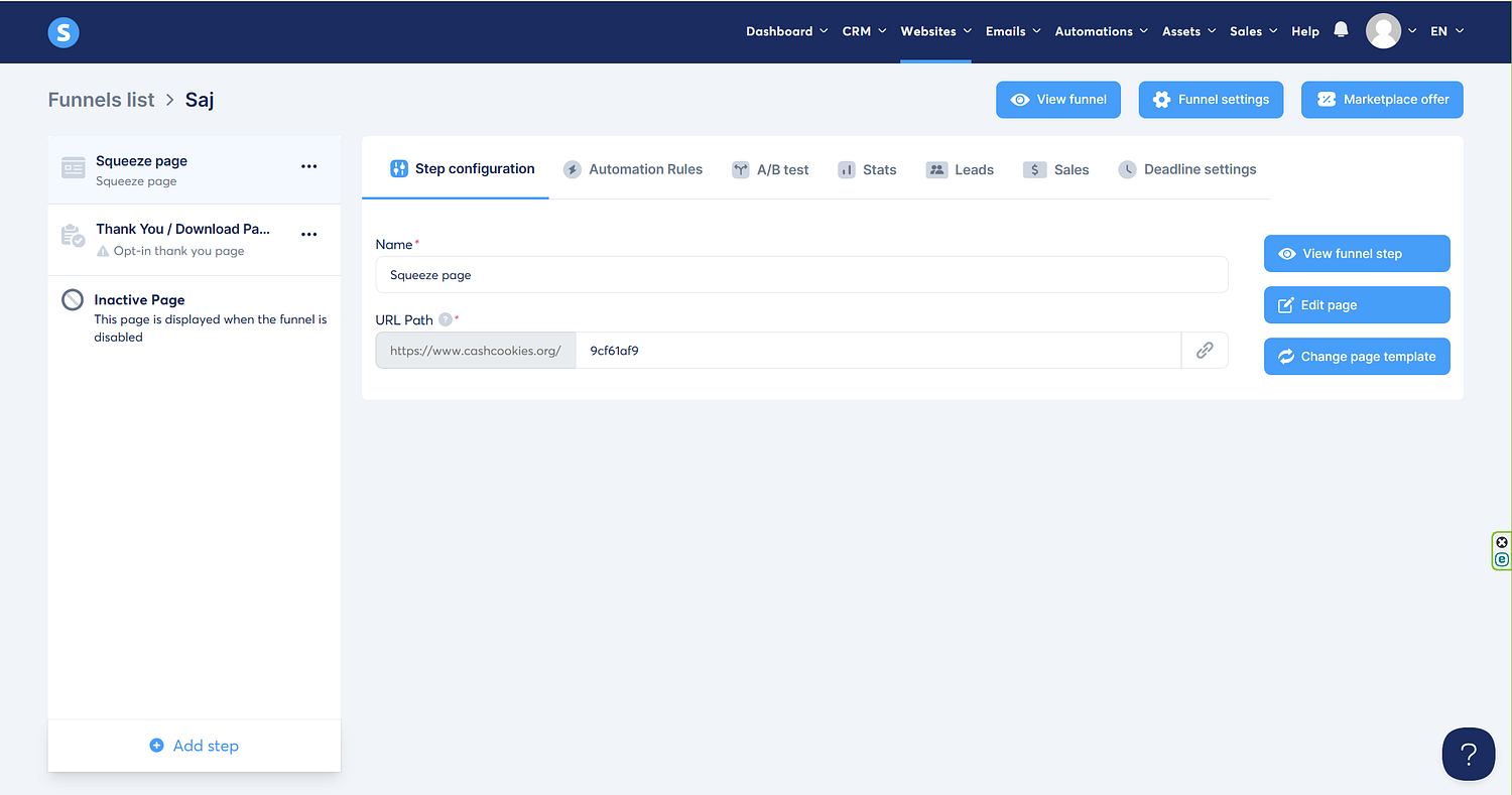
From the screen above, click the ‘Edit page’ option to edit the funnel.

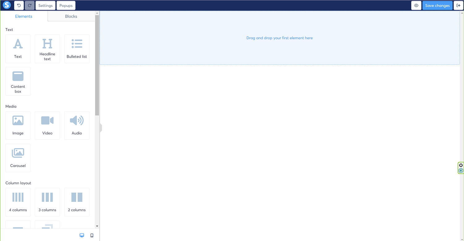
Systeme.io, in its infinite wisdom, provides you with several pre-designed landing page templates. These are great if you like things done for you — which, let’s be honest, most of us do. So, from a wide variety of the landing pages, I’m going to pick the first template I see; actually I could pick any template for this demonstration, it does not really matter, because I’m going to anyway strip the template off of all its elements, and show you how to start from scratch. So, I picked the following template.

Next, I’m going to take the cursor to the top right corner of each section, which is highlighted in green, and then hit the trash icon to delete the section. You might have to do this a few times, depending on the number of sections your template has, until you see a naked template like the following.
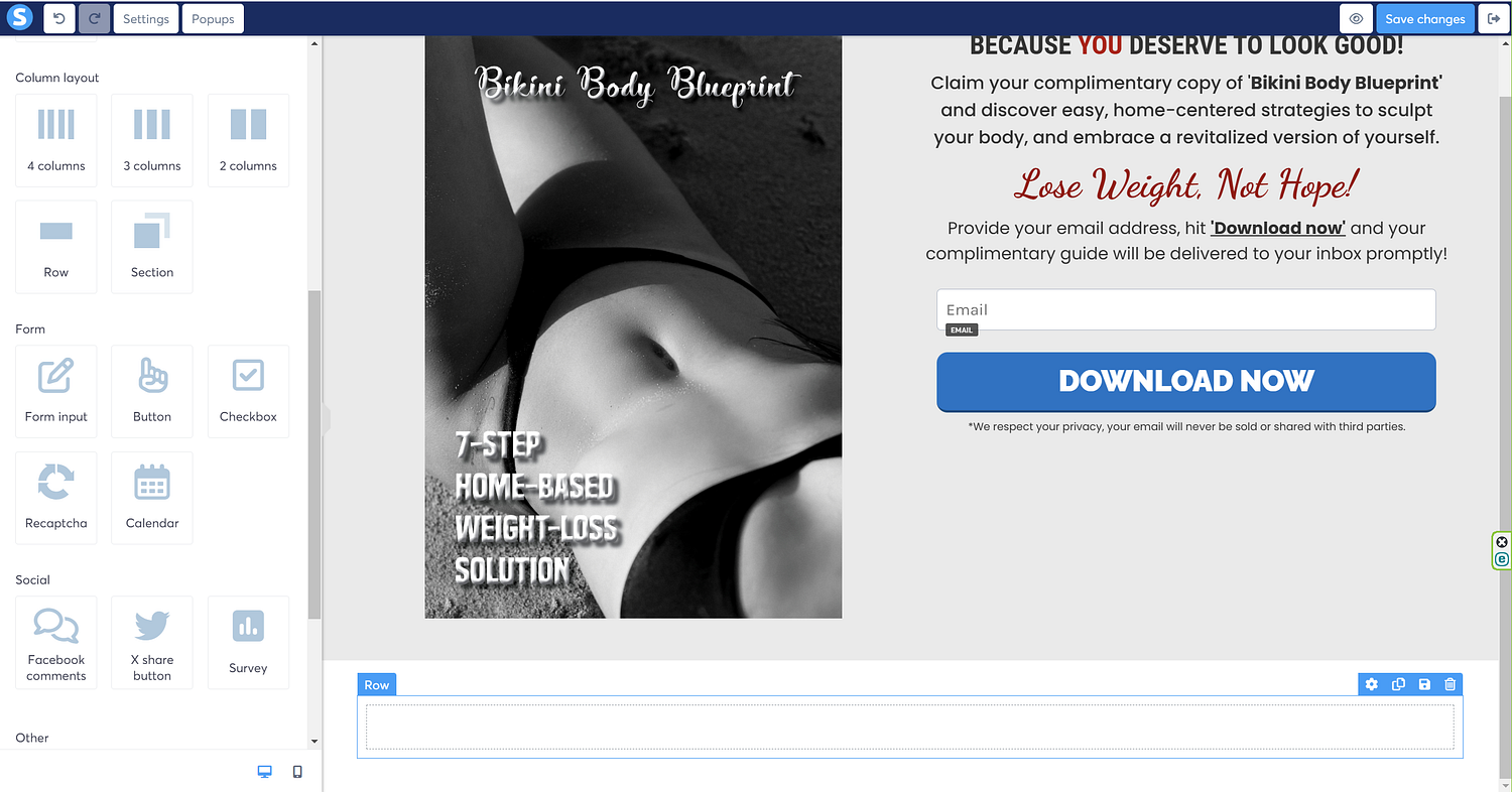
Now, I’m going to click the ‘2 columns’ option from the Column layout on the left, and drag it to my empty template.
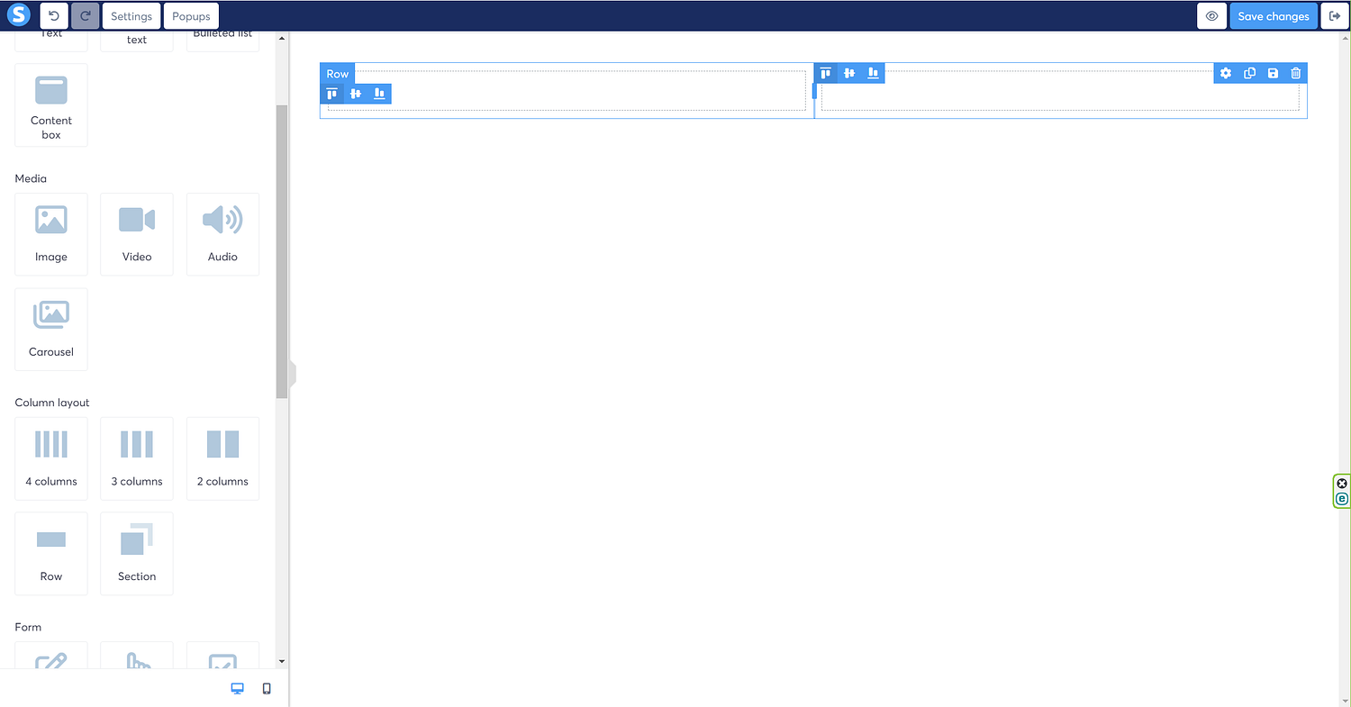
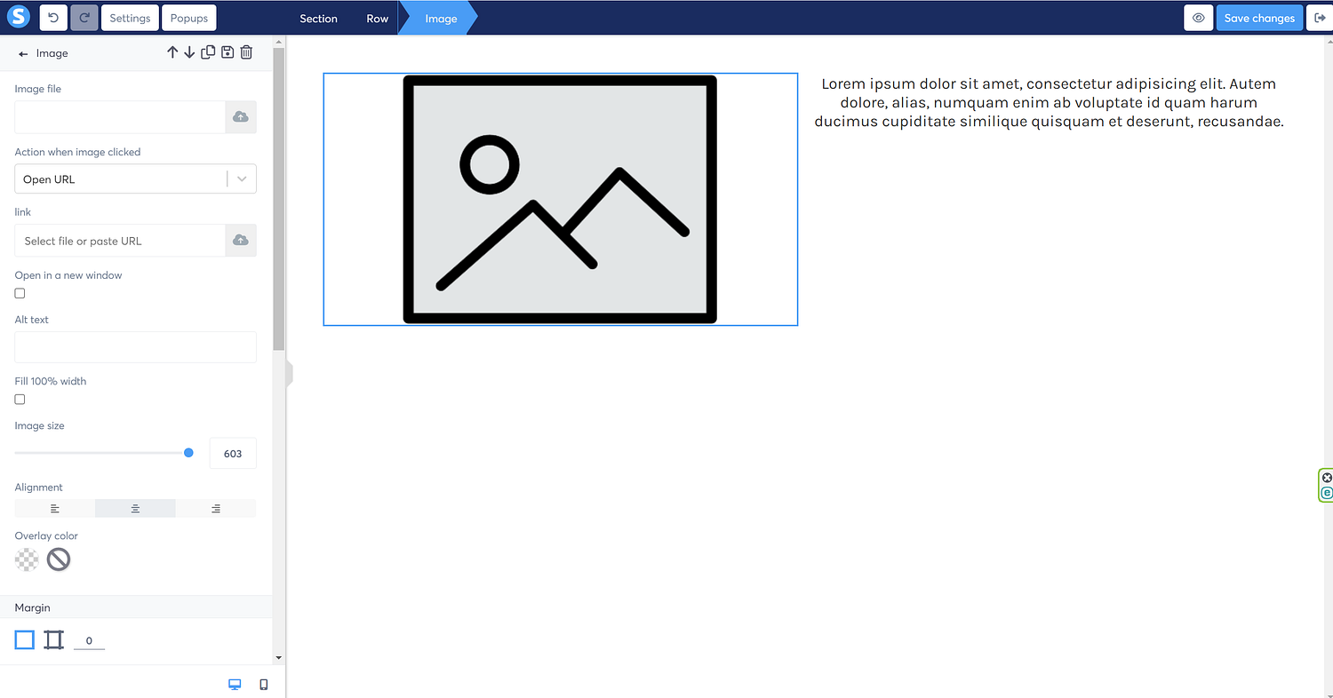
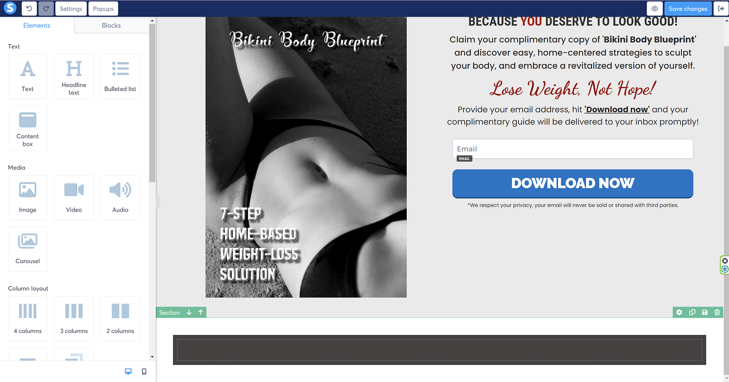
The next step is to click the ‘Image’ from the Media menu on the left, and drag it inside the left column.
Similarly, drag the ‘Text’ option from the Text menu, and drag it to the right column.
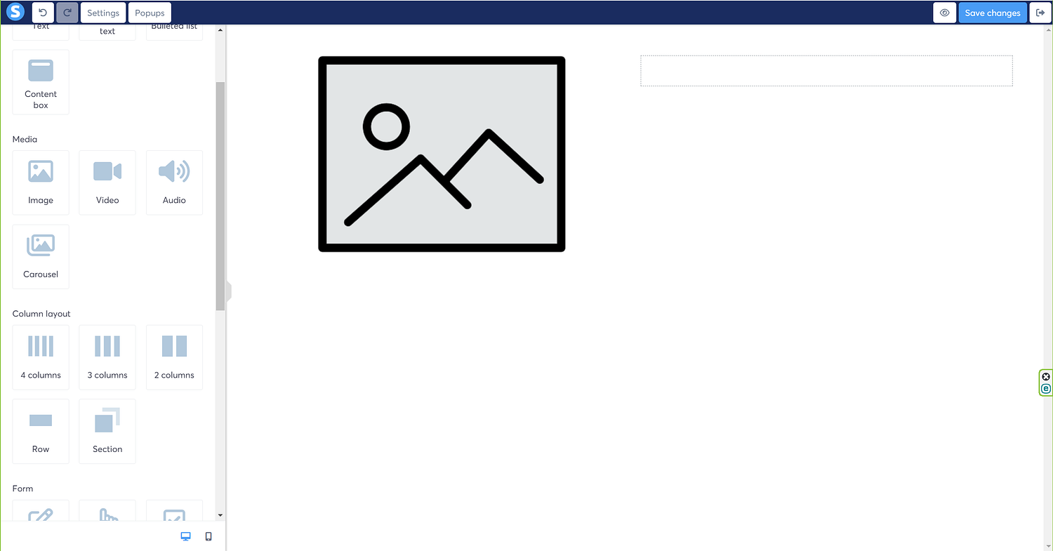
The next step is to add an image to the image element that we added a few seconds ago. So, to do that, click the cloud option in the ‘Image file’ menu on the left. I’m doing this because I already have images uploaded to the cloud; you also have an option to directly paste the link of the media that you would like to use here, but for that you will need to use the ‘link’ option that is sitting right under the ‘image file’ option on the left.
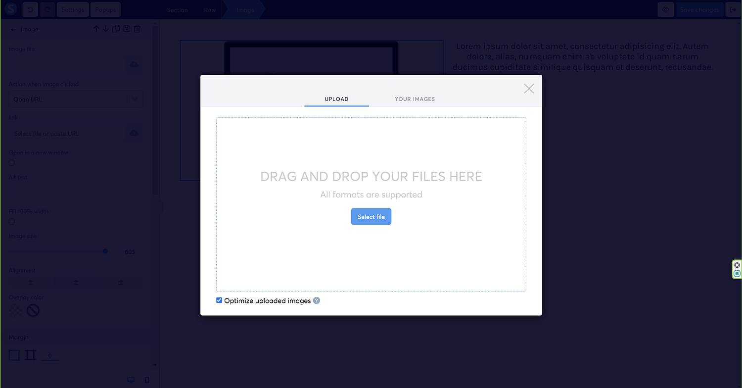
The moment I click the cloud button, the following screen pops up through which I can select the image that I’d like to use from my computer.
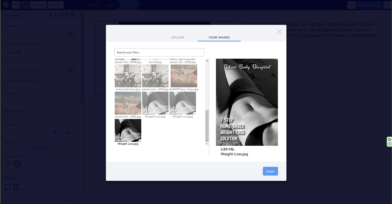
Once my image is uploaded, the ‘your images’ tab gets thrown onto the screen, so just select the image, and hit the ‘insert’ button, sitting at the bottom right corner of the screen.
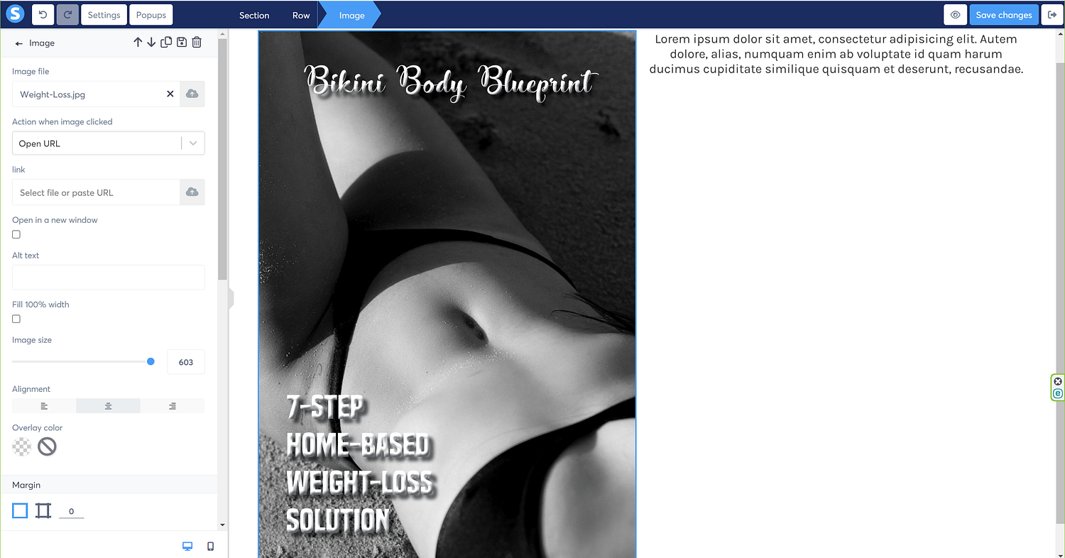
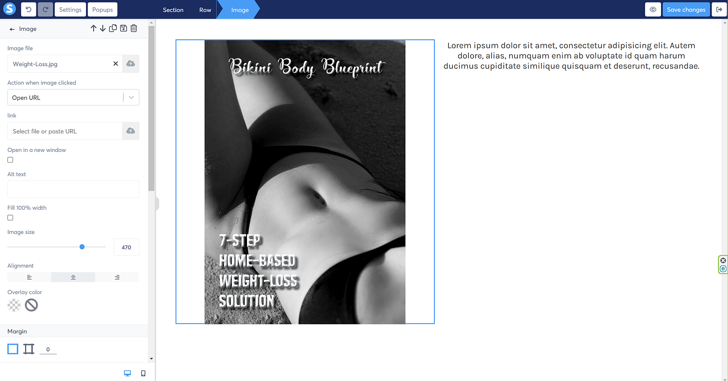
This is how the image looks, which is a lot bigger than what I want, so not to panic. I’m going to use the image size slider on the left panel, and slide left to reduce the size of the image.
So, you see how I reduced the image using the image slider, and now it looks like the following screen.
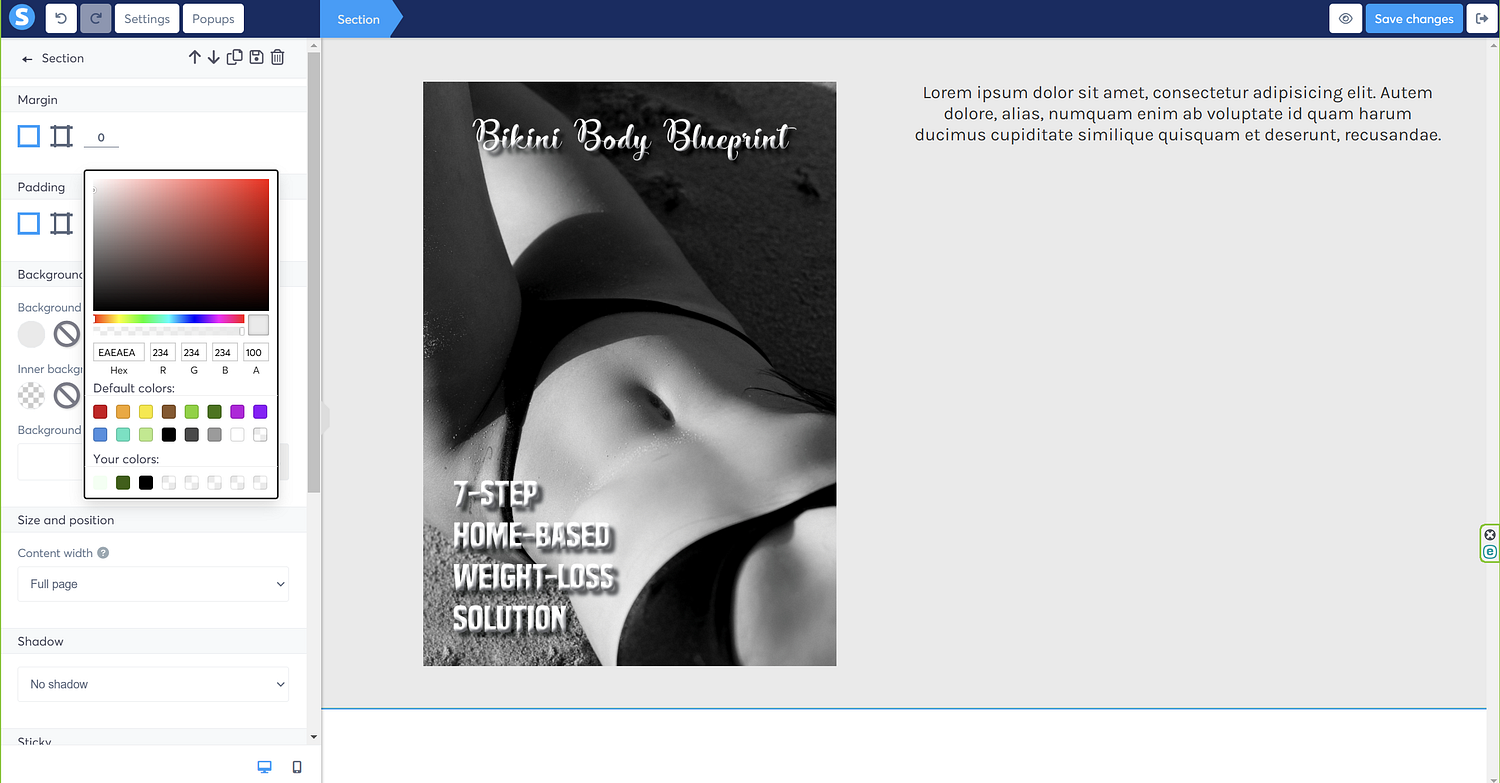
Next, I’m going to use the background color option on the left panel, and change the color of the background to any color of my choice.
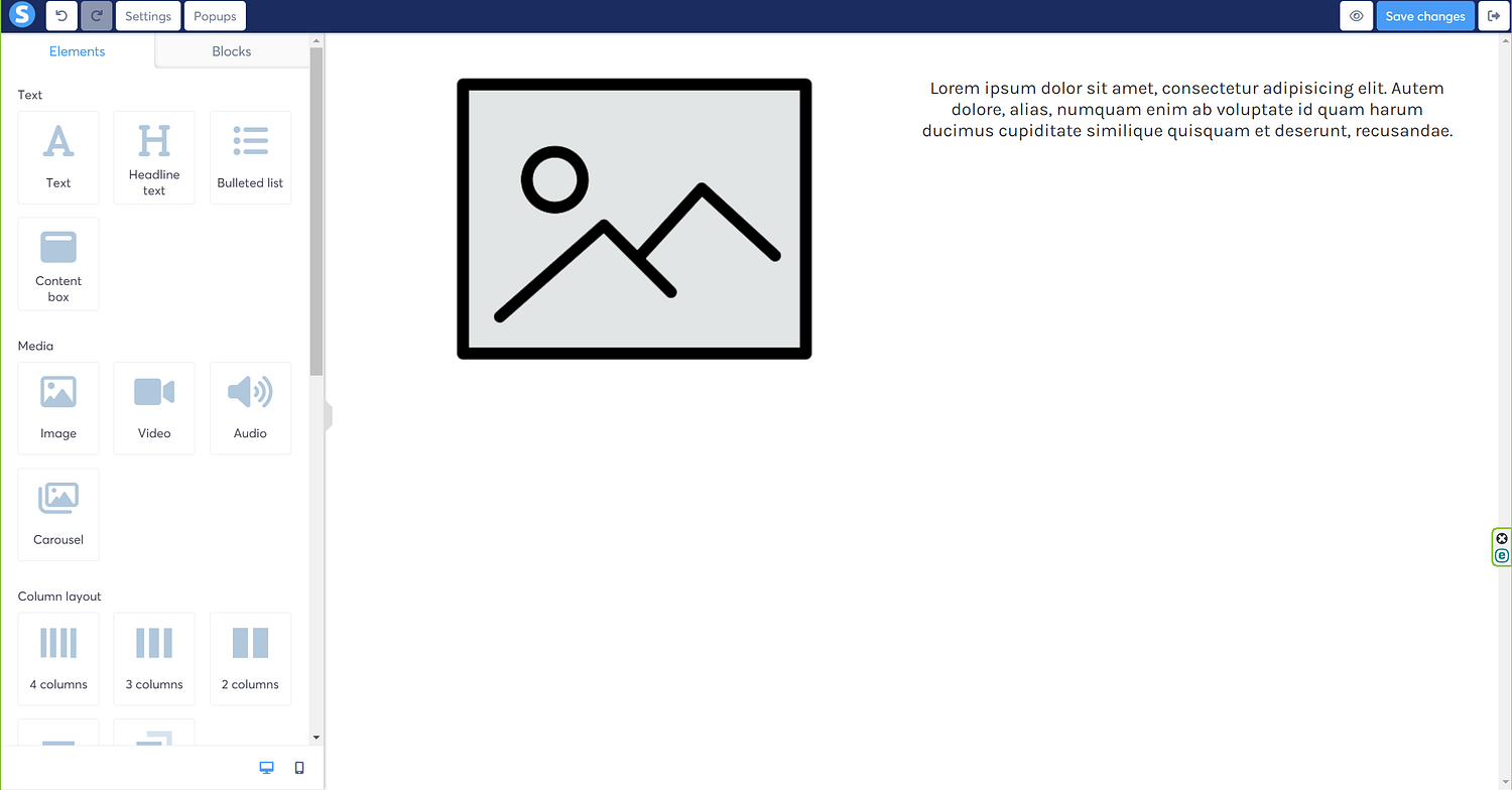
It’s time to update the text on the right column, so let’s type in the text, and I can always update the font using one of the options listed in the dropdown menu of ‘font type.’
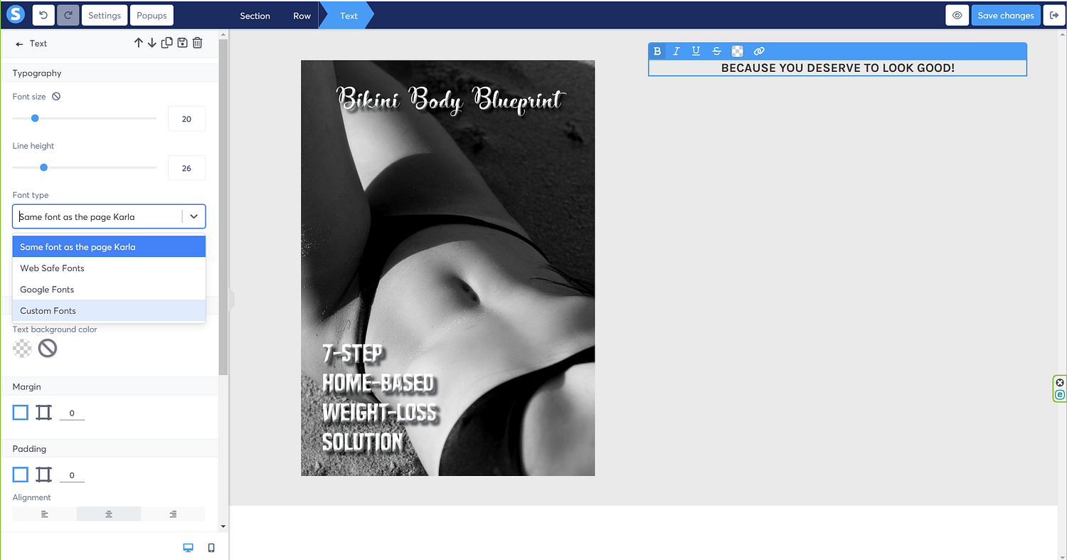
You guessed it right! I’m going to select ‘Google fonts’ from here, which will throw open the different Google fonts, along with the font size, font style, letter spacing, and line height as well.

Once satisfied with the look of the text, we can move on to the next step.

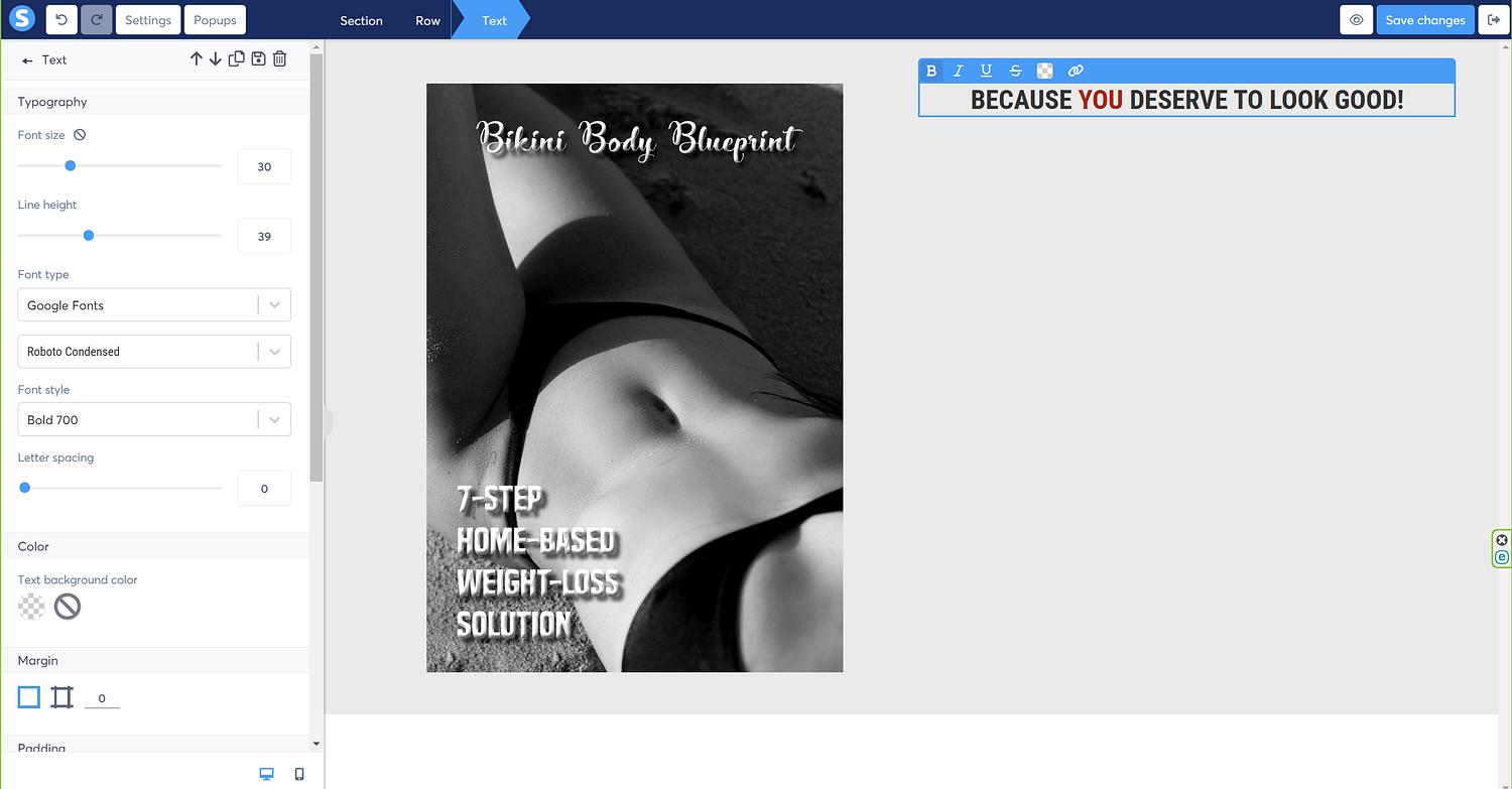
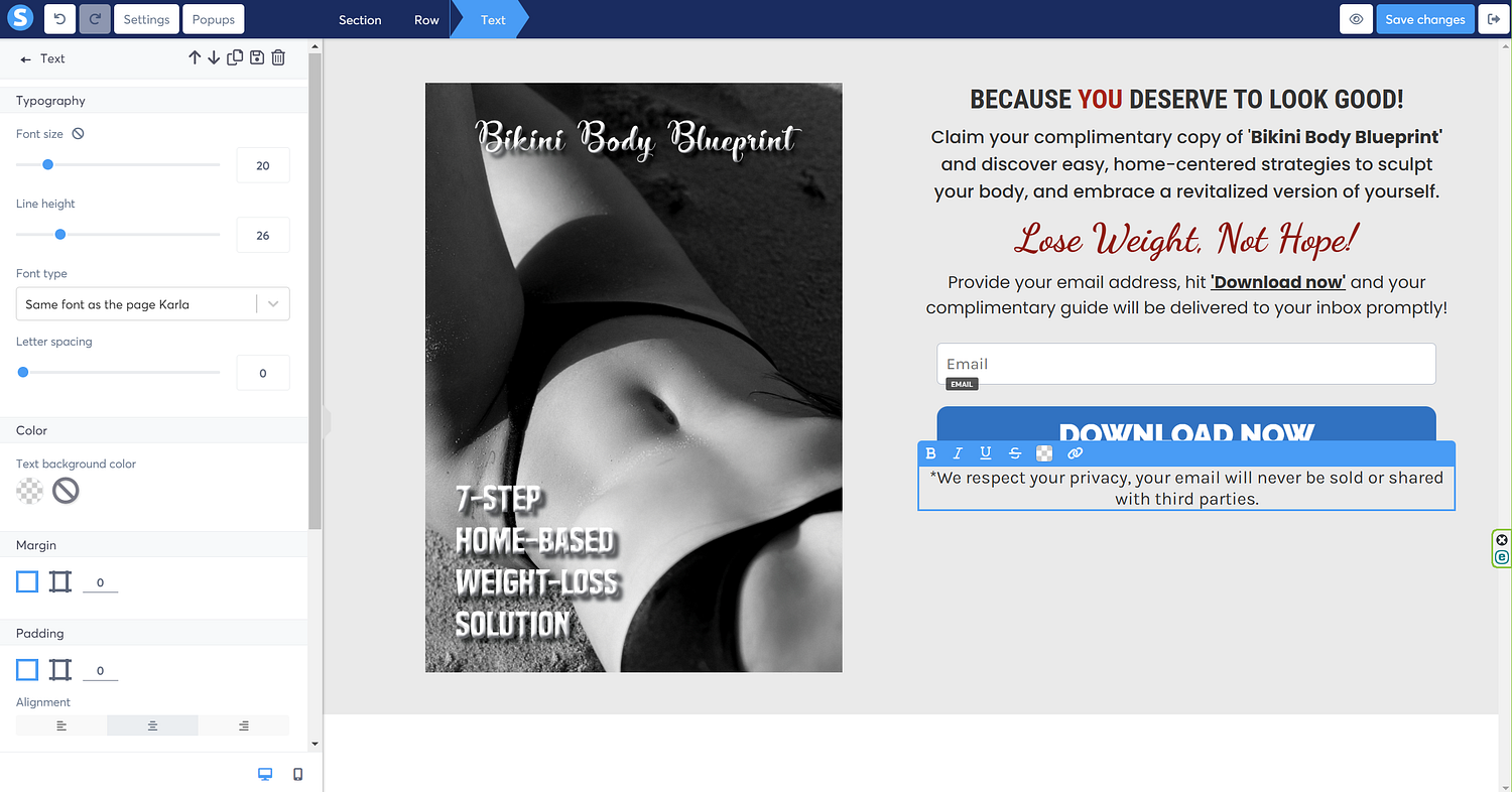
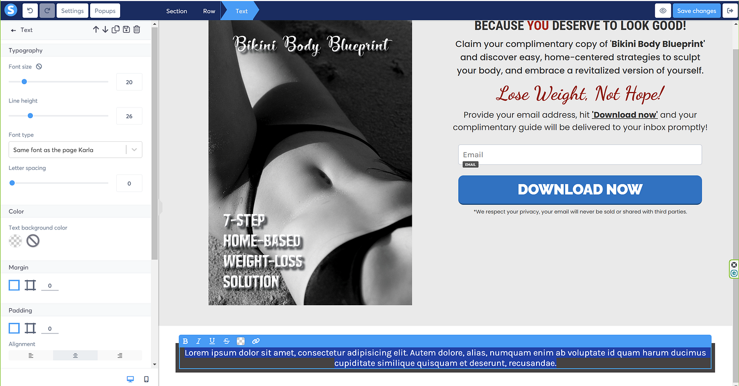
Actually, I’d like to highlight the word ‘you’ using a different color, so I’m going to select it using the cursor.

And right above the text are the options where I can update the text to bold, italics, underlined, strike through, change color, and hyperlink it, so click the change color option and change the color of the word to red.
Next, much like earlier, I’m going to click-drag the text option and place it under the existing text.
Now update the text to your requirement.

Time to throw in more text, so click-drag the text option once again right under our existing text, as illustrated in the following image.
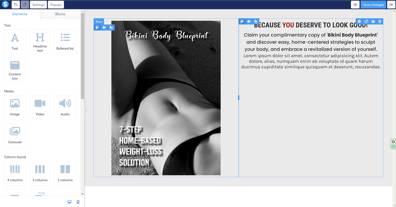
Update the text, the font, and the text size as per the requirement.
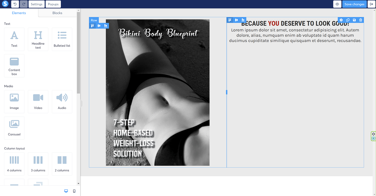
Keep adding text, as per the requirement, and edit it to suit your need.

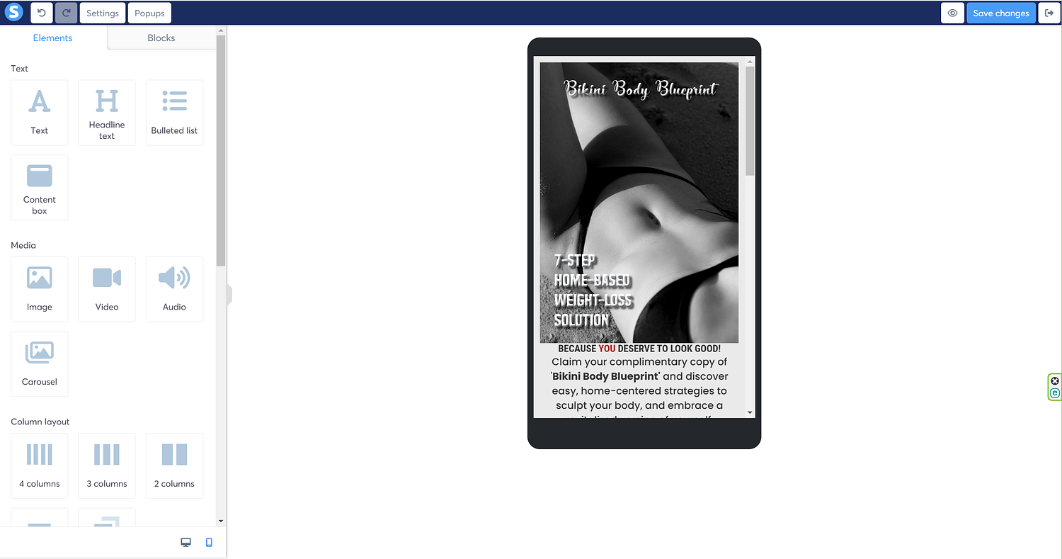
After I have added and edited my text, it should look something like in the following image.
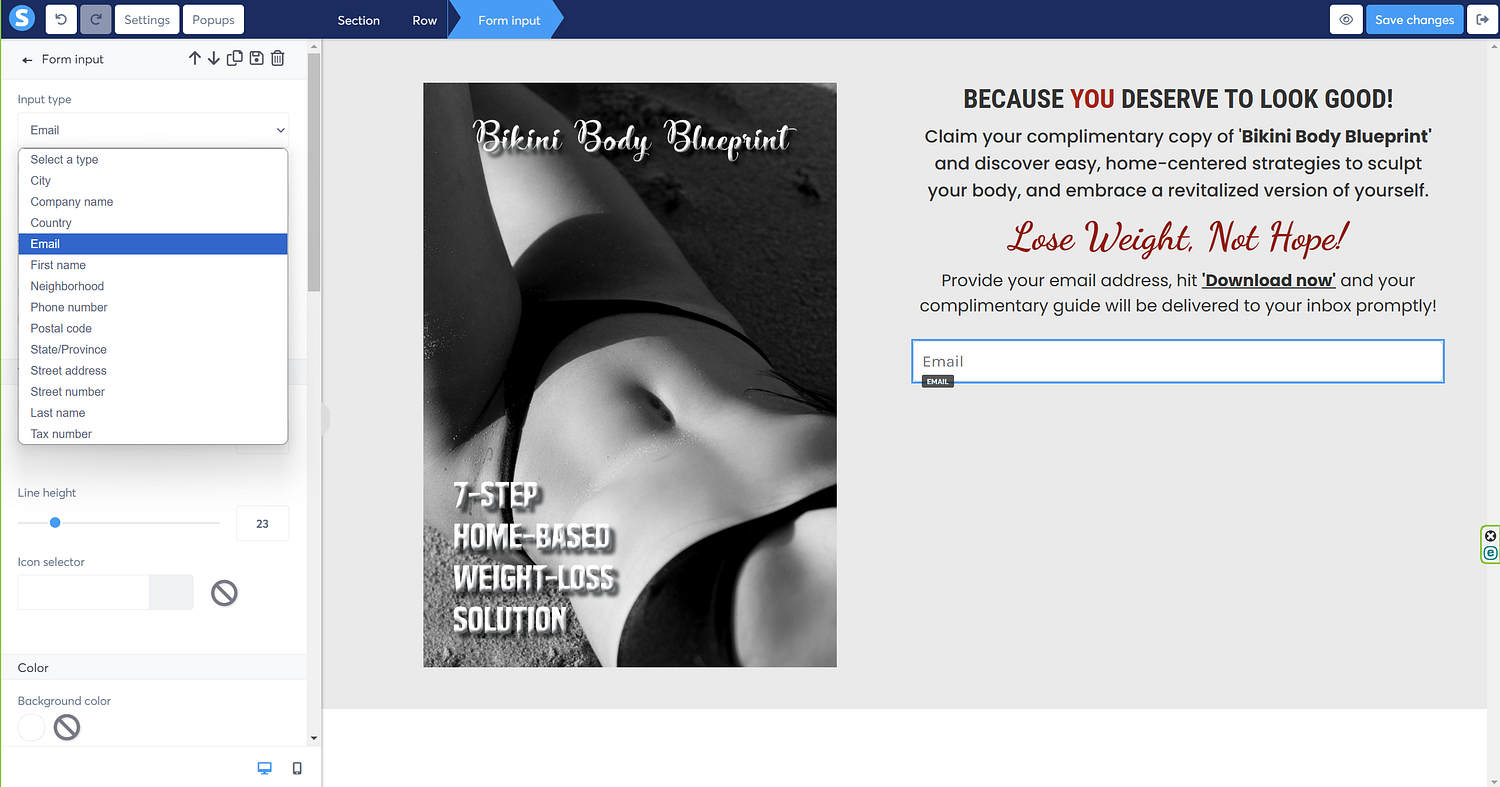
Next, I will need to insert a box to capture the email of the subscribers, so I’m going to drag the ‘form input’ option and throw it right under the last text, and it shall look something like in the following image.

Now, specify in the ‘form input’ dropdown, what you want this form input for; since I want it to capture emails, I’ll select that from the list.
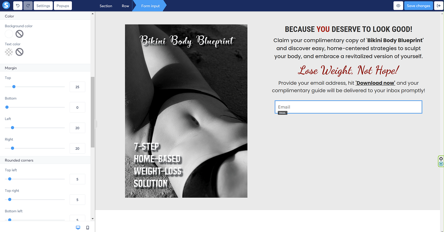
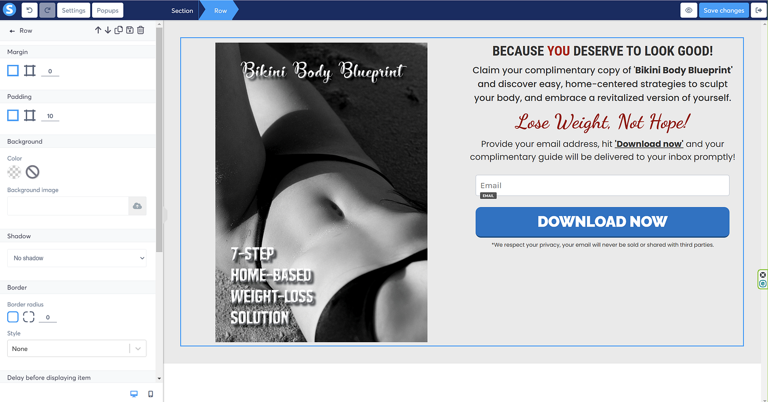
Next I’ll do some margin adjustments so as to ensure there is ample spacing all around. Play around to get the right margin for your elements on the screen; you can do it for all four sides: top, bottom, left & right.
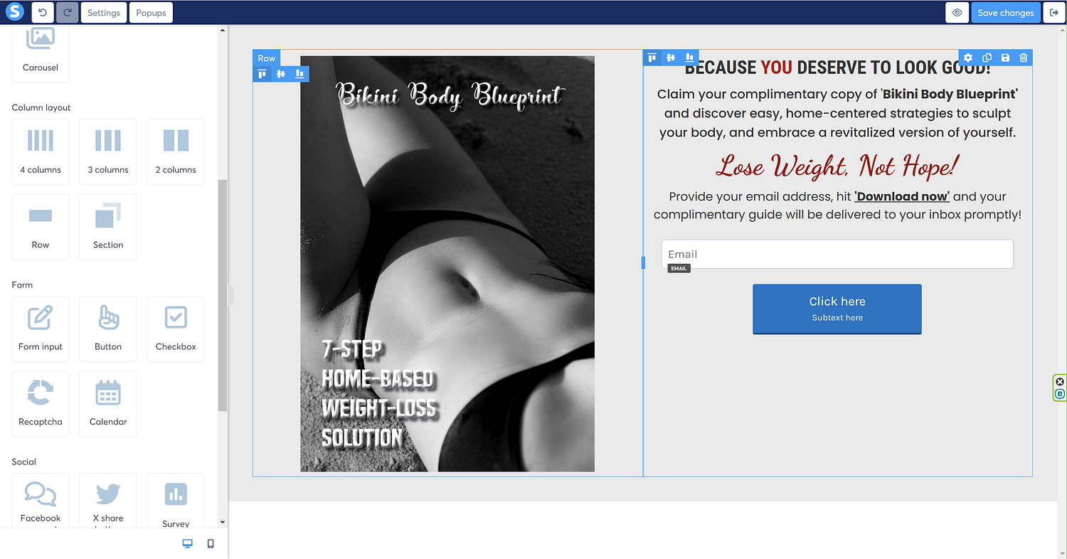
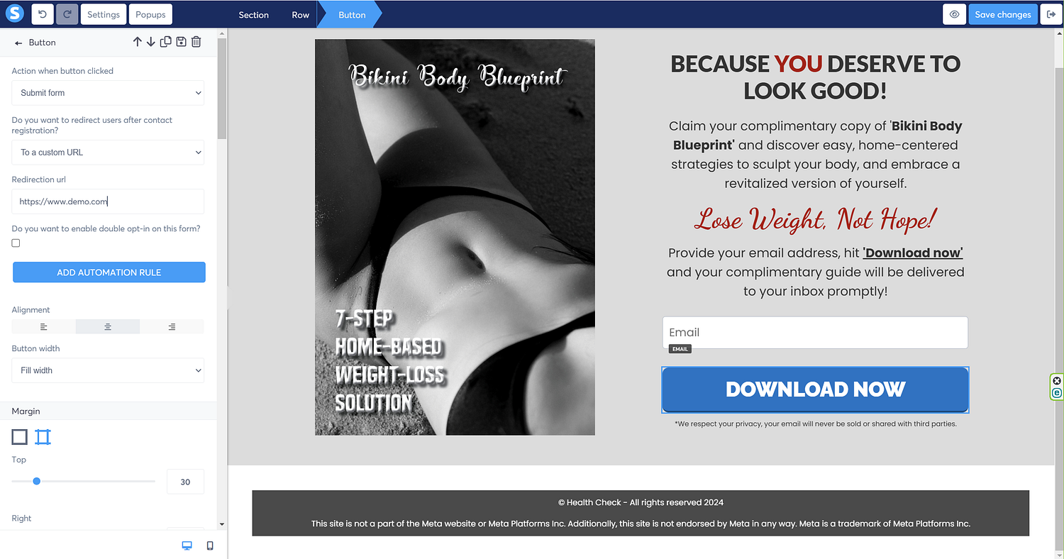
Now for the call to action, since we’ve added the form input, we’ll need a button where visitors can hit to subscribe, so click-drag the ‘button’ right under the form input, as illustrated in the following screen.
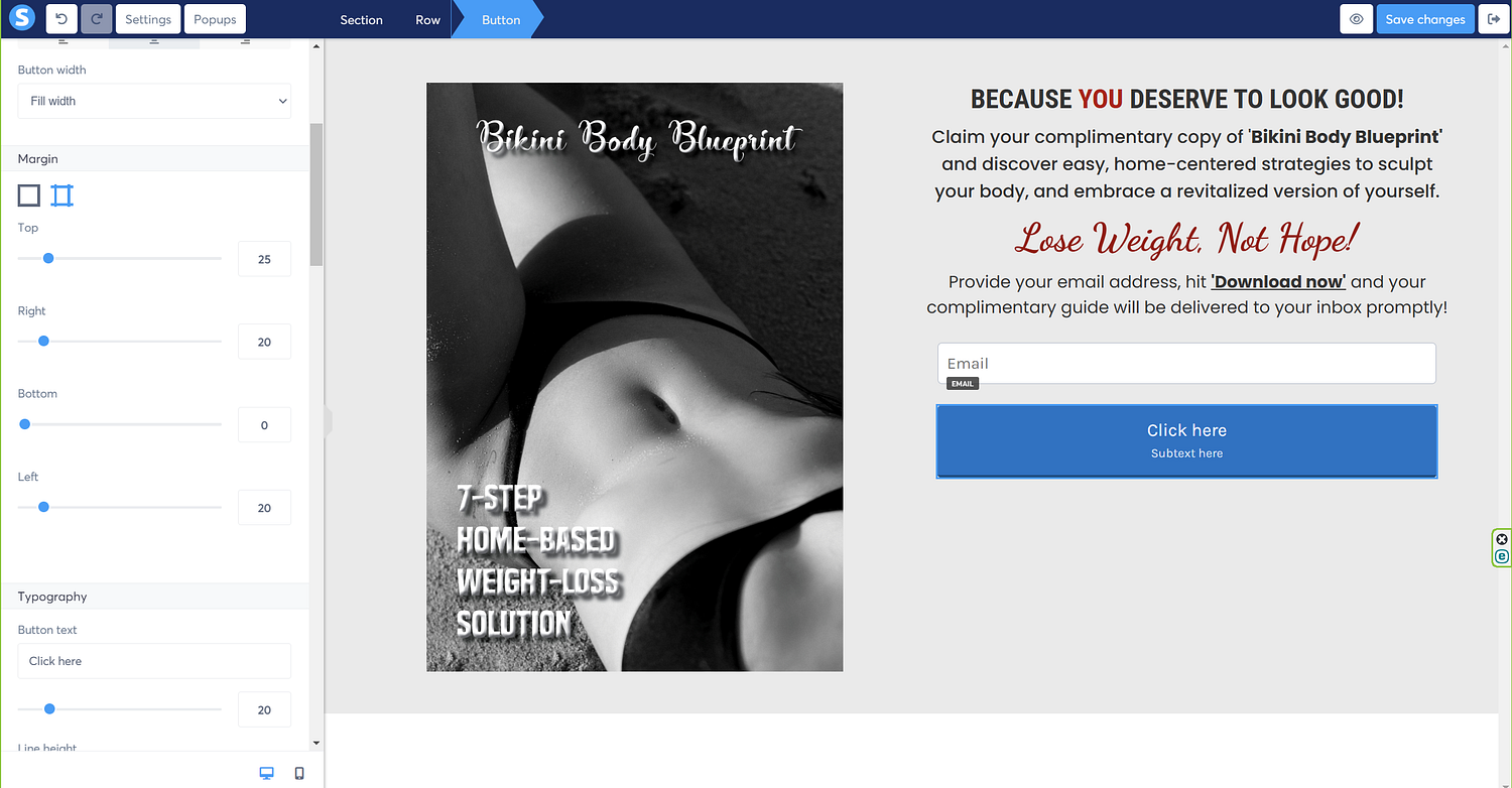
Time to adjust the size and appearance of the button, so let’s change the width to ‘fill width’ for the sake of uniformity with the form input.

Let’s play with the button margins to align it with the form input.
The next step is to update the button text, so I’ll change it to ‘download now.’ You can always change the font, and font size of the button text, under the ‘typography’ section on the left, as shown on the left side of the image.
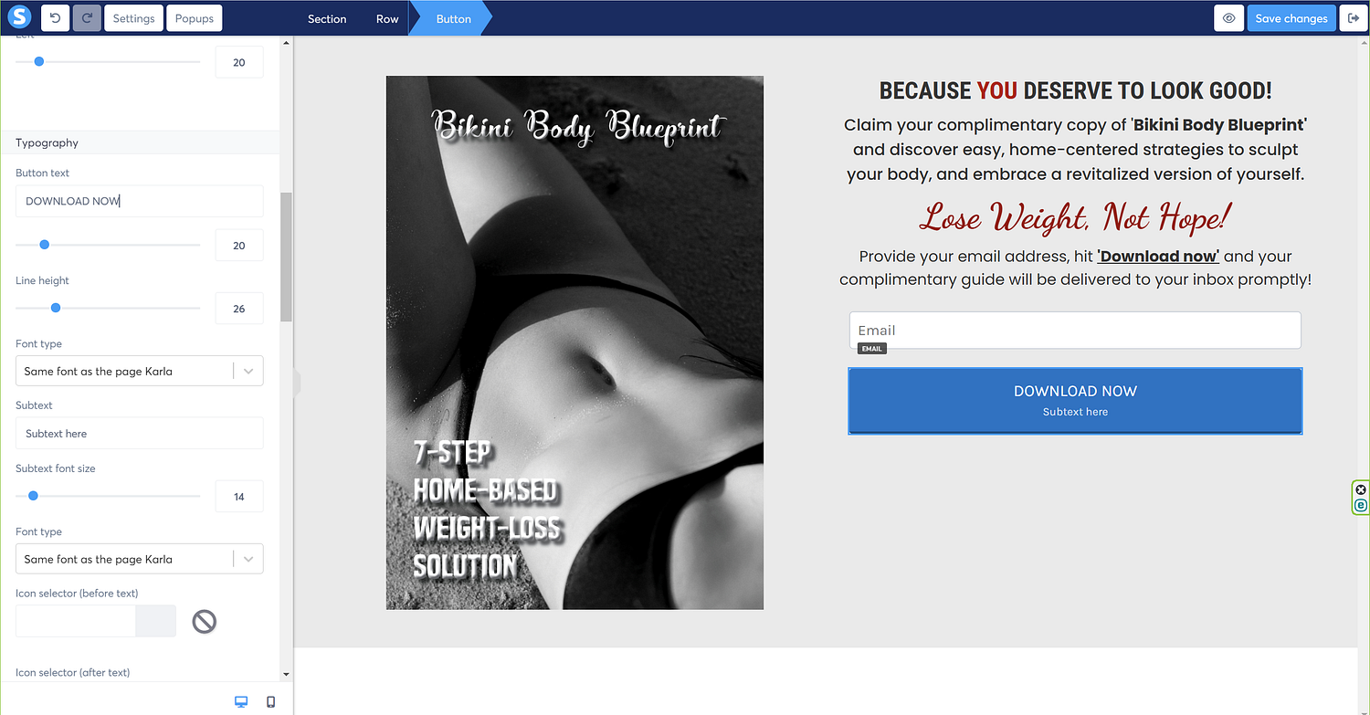
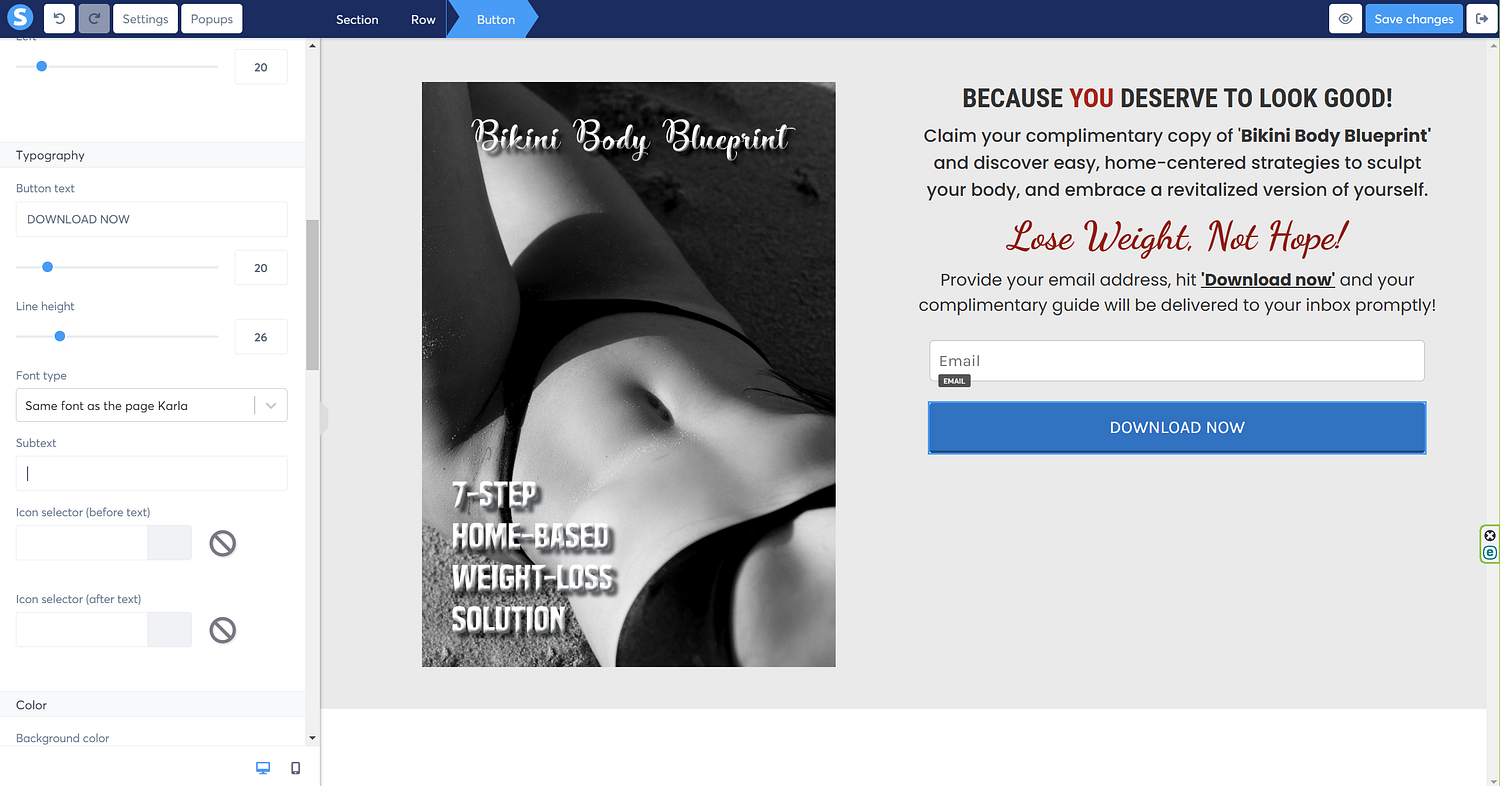
Since, I don’t need the subtext, I’ll remove that from the button.
Time to highlight the button text, so I’m going to update the font, and increase the font size, as illustrated.

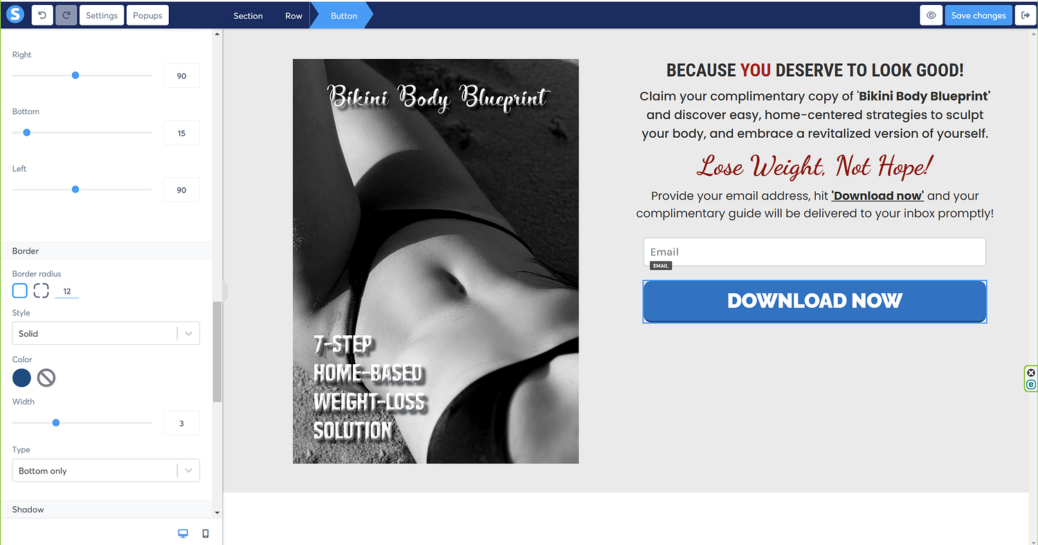
I’ll then round the corners of the button to make it look neater using the ‘border radius’ option; I’ve set it to 12 for this illustration.
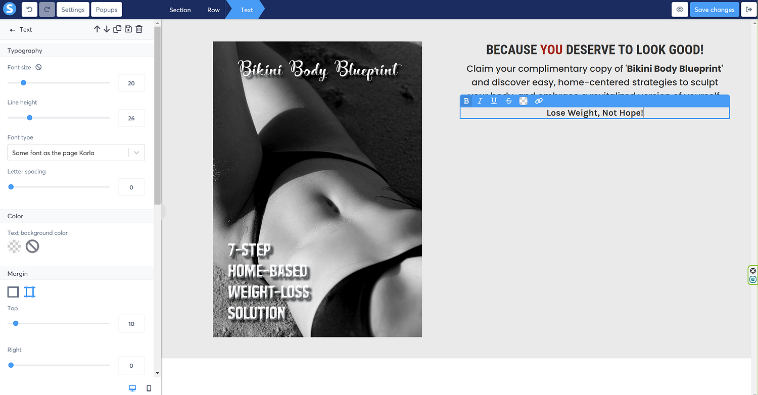
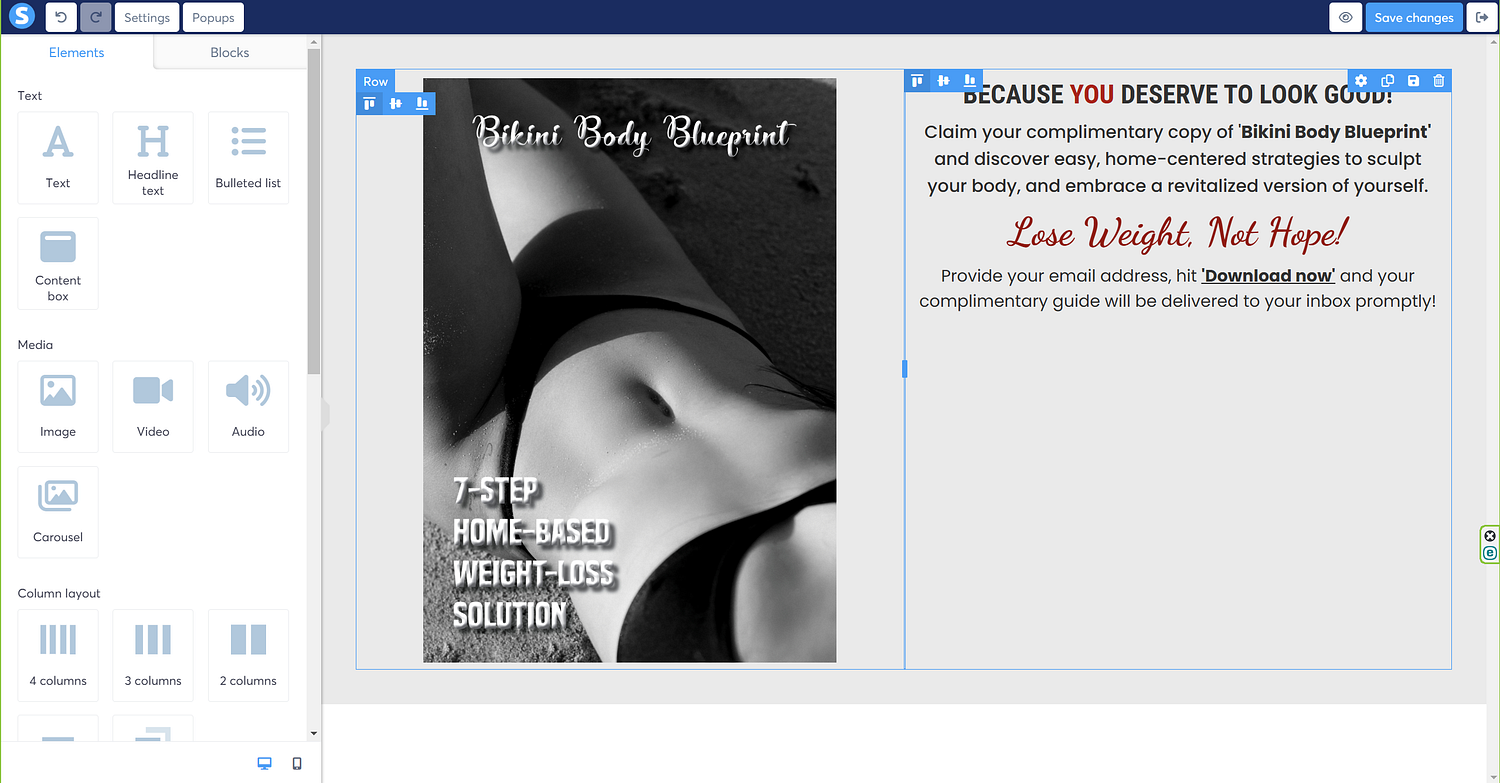
Time to add more text right under the button, so click-drag the text, much like we did earlier.
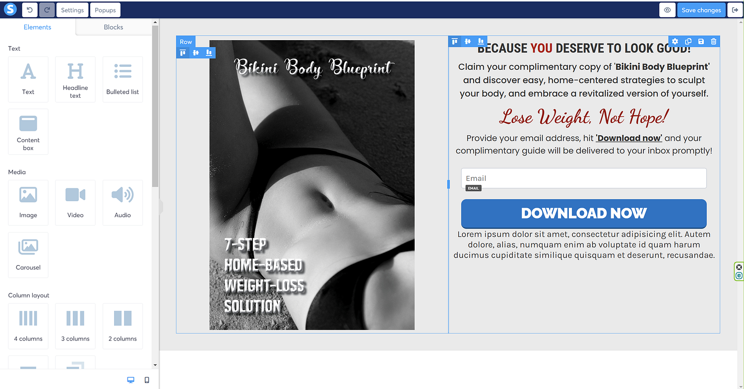
Next, update the text, as illustrated in the following image.
I’ll update the size of the text to a smaller size to fit within the bounds of the button, as illustrated.
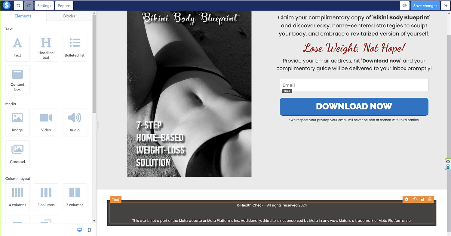
I’ll then add the final row at the bottom of the screen that will act as the footer.
Update the background color of the row, as illustrated.
Now, throw in the text field into the row, as illustrated.
Update the footer text, as illustrated.
Now, click the ‘eye’ icon at the top right corner to check the preview of the page.
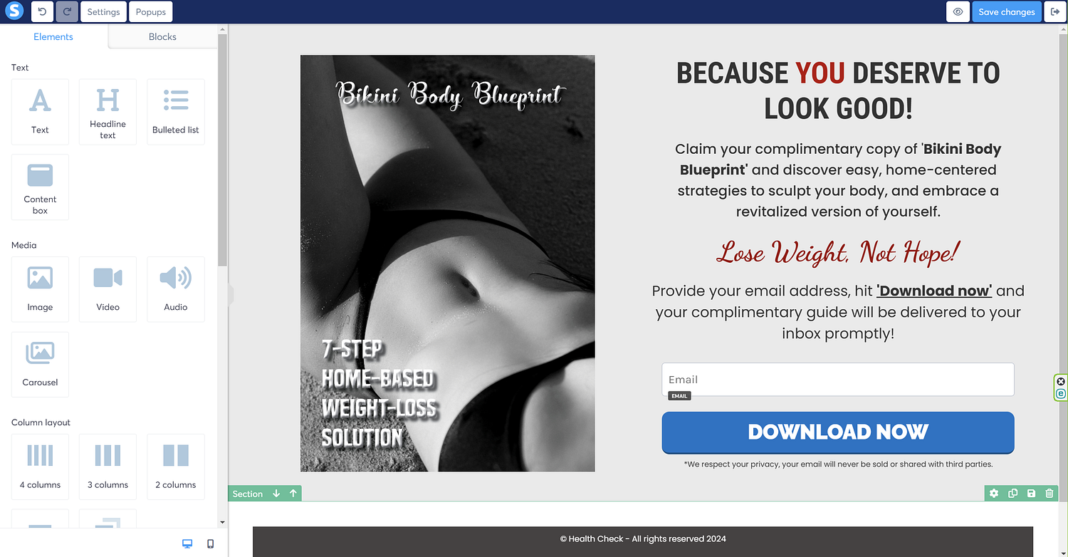
So, this is how your landing page will look like on a computer screen.
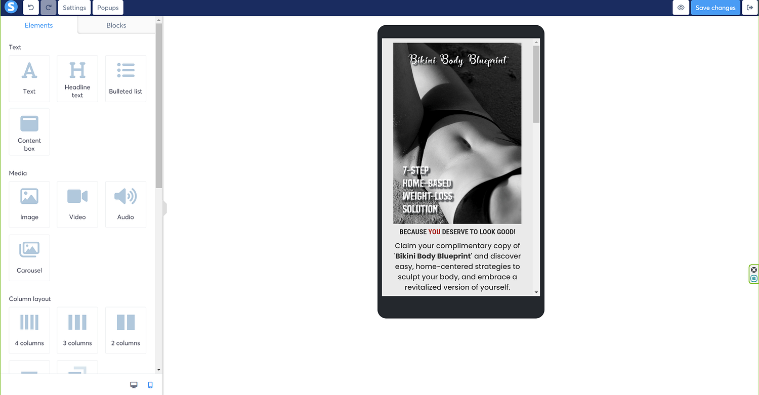
Let’s also tweak the settings to make the content look presentable on a mobile as well, and for that, click the tiny mobile icon that sits at the bottom left corner, next to the computer icon, and the screen should look something like in the following image.
Now, there isn’t much we need to do here, except updating the image size, and the margins between the image, and the rest of the texts we’ve used, and we do it the same way we updated the margins earlier. Just ensure to select the element first, and then update the margins.
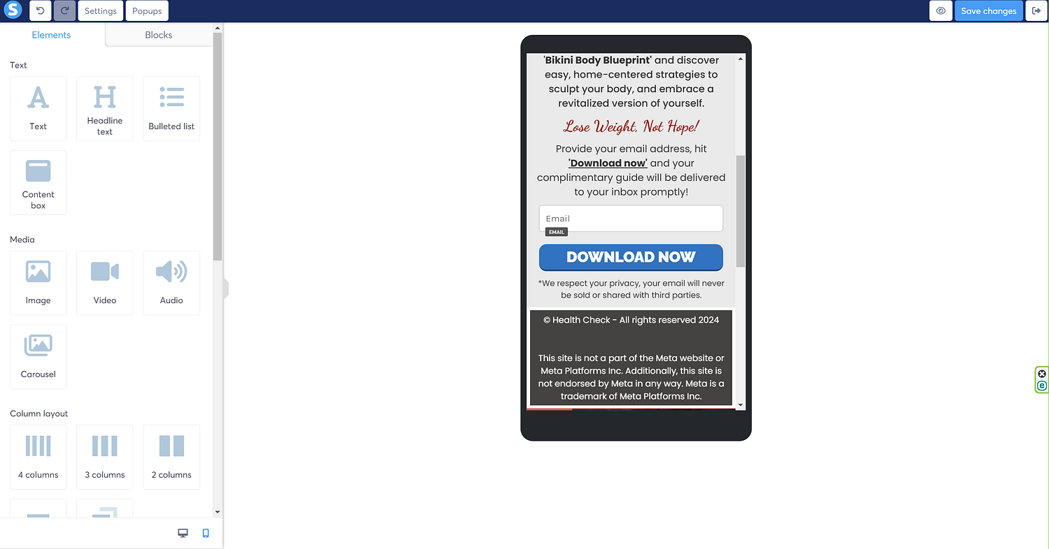
So, after updating the margins, my mobile page is also looking pretty nice.
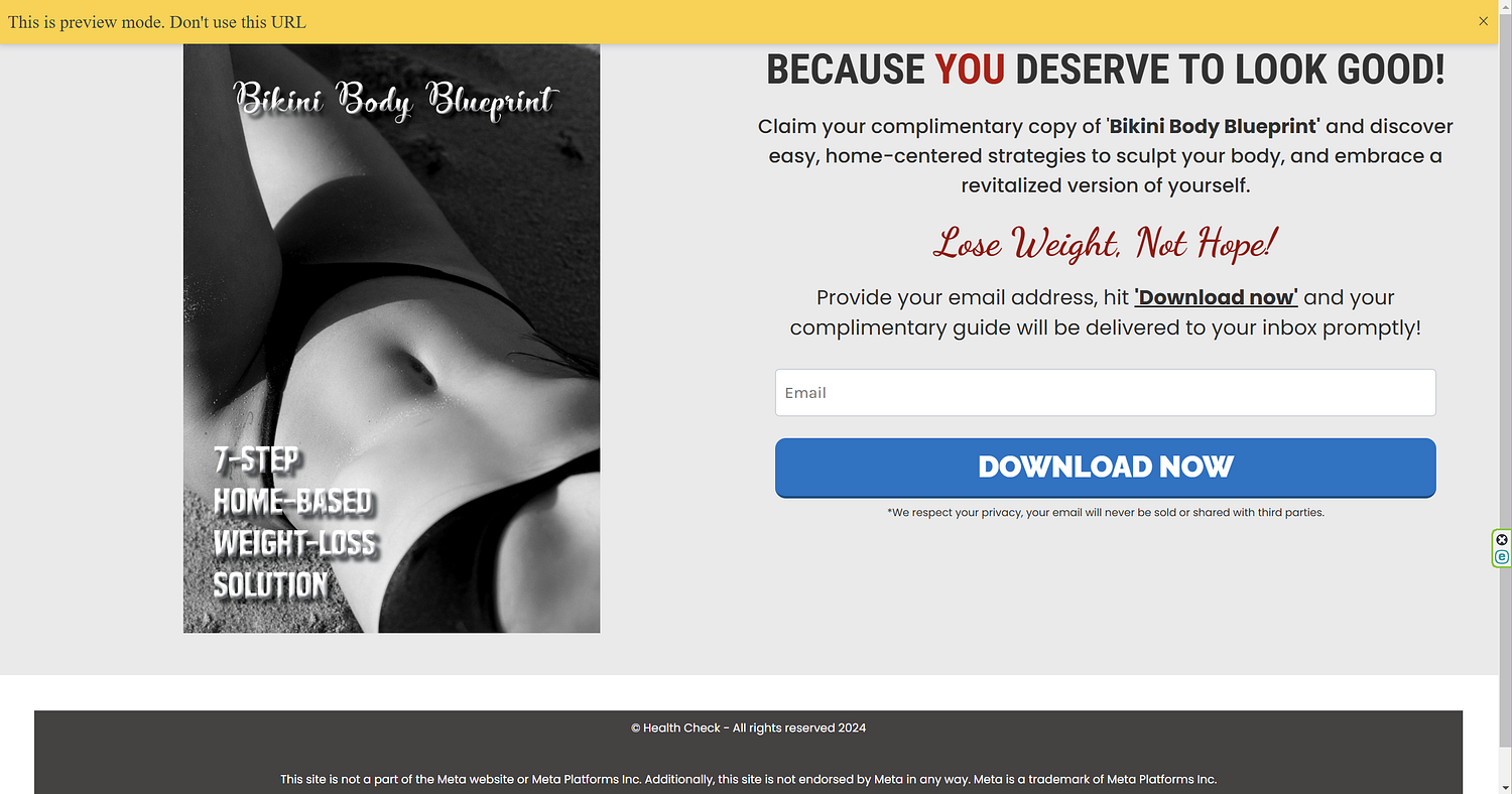
That’s the final landing page. Congratulations! You’ve just learnt how to design a landing page on Systeme.io.
In the similar fashion, you can update the ‘thank you’ page as well.
You just built a landing page in Systeme.io, and you didn’t even throw your laptop across the room — impressive! Now, drive traffic to it, tweak it based on performance, and watch your email list grow.
If you found this guide helpful (or at least mildly entertaining), share it with a fellow marketer in need. And remember: A great landing page doesn’t have to be perfect — it just has to work.
Happy building!